Warehouse Stationary
CLIENT
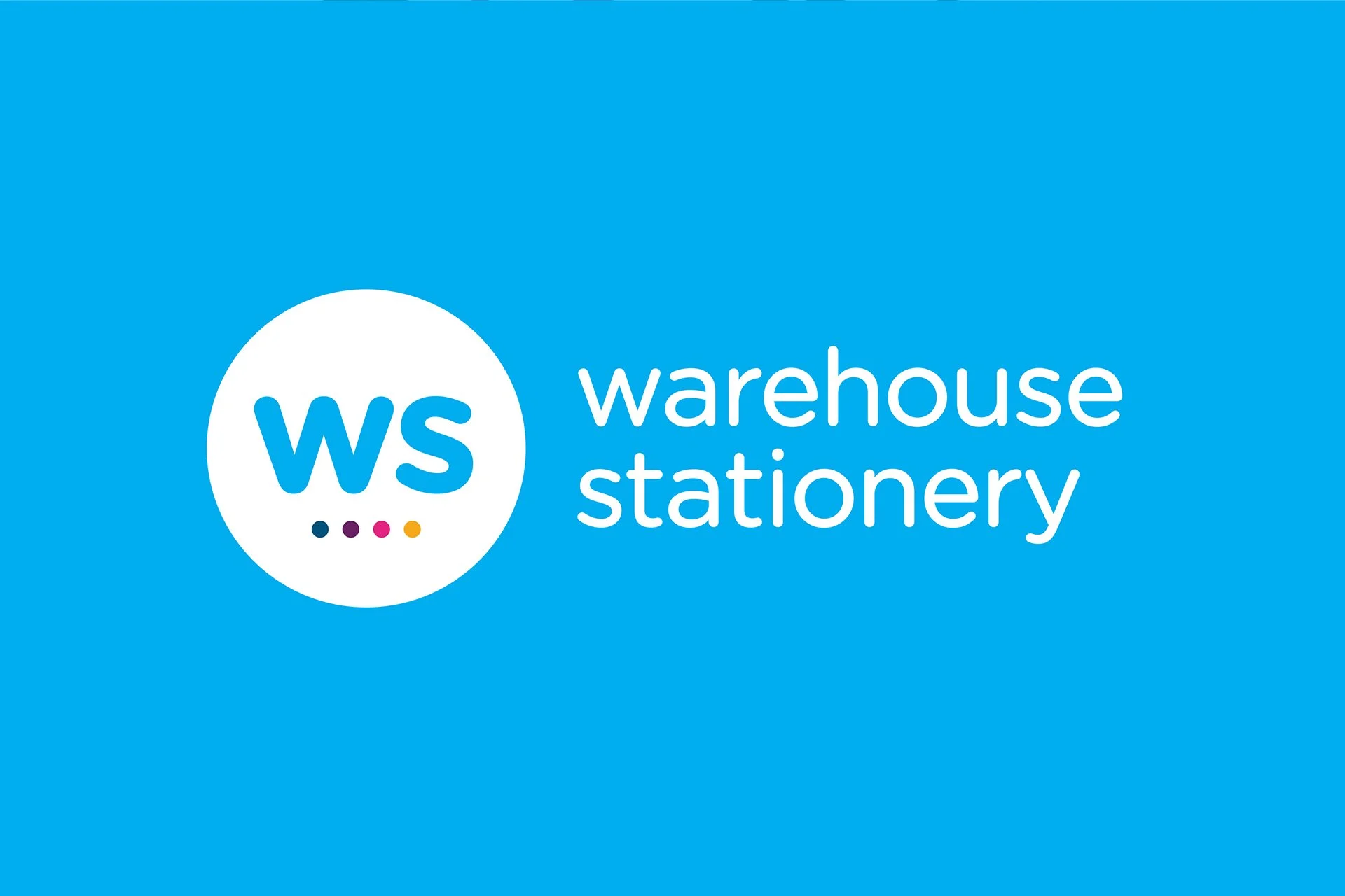
WAREHOUSE STATIONARY
99
RESPONSIBILITIES
DESIGN DIRECTION
-
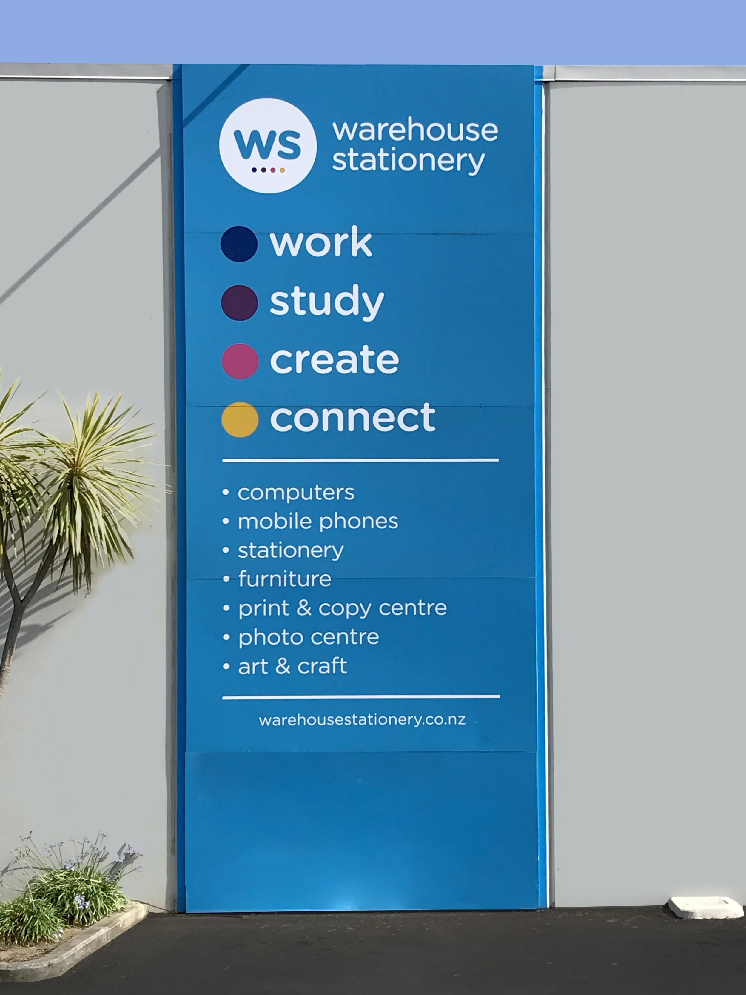
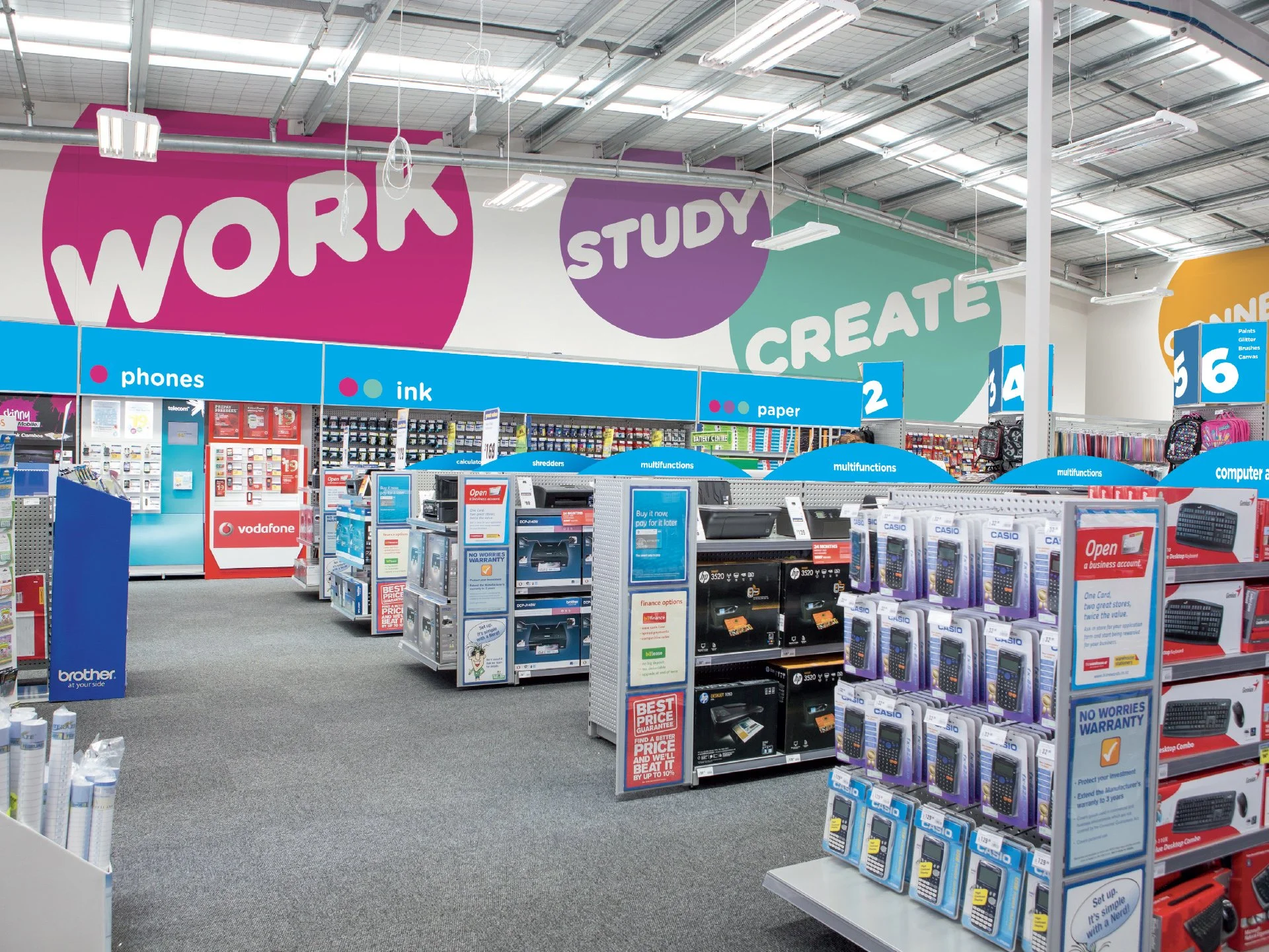
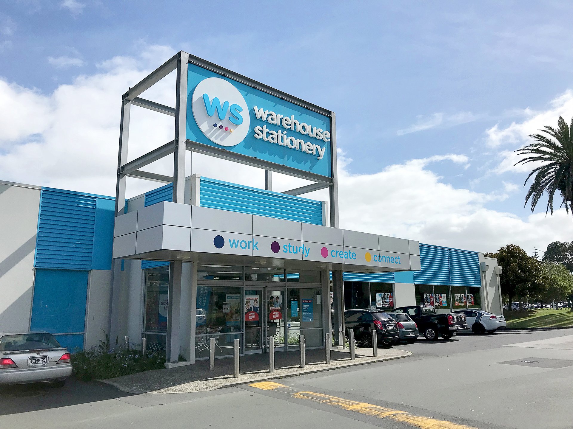
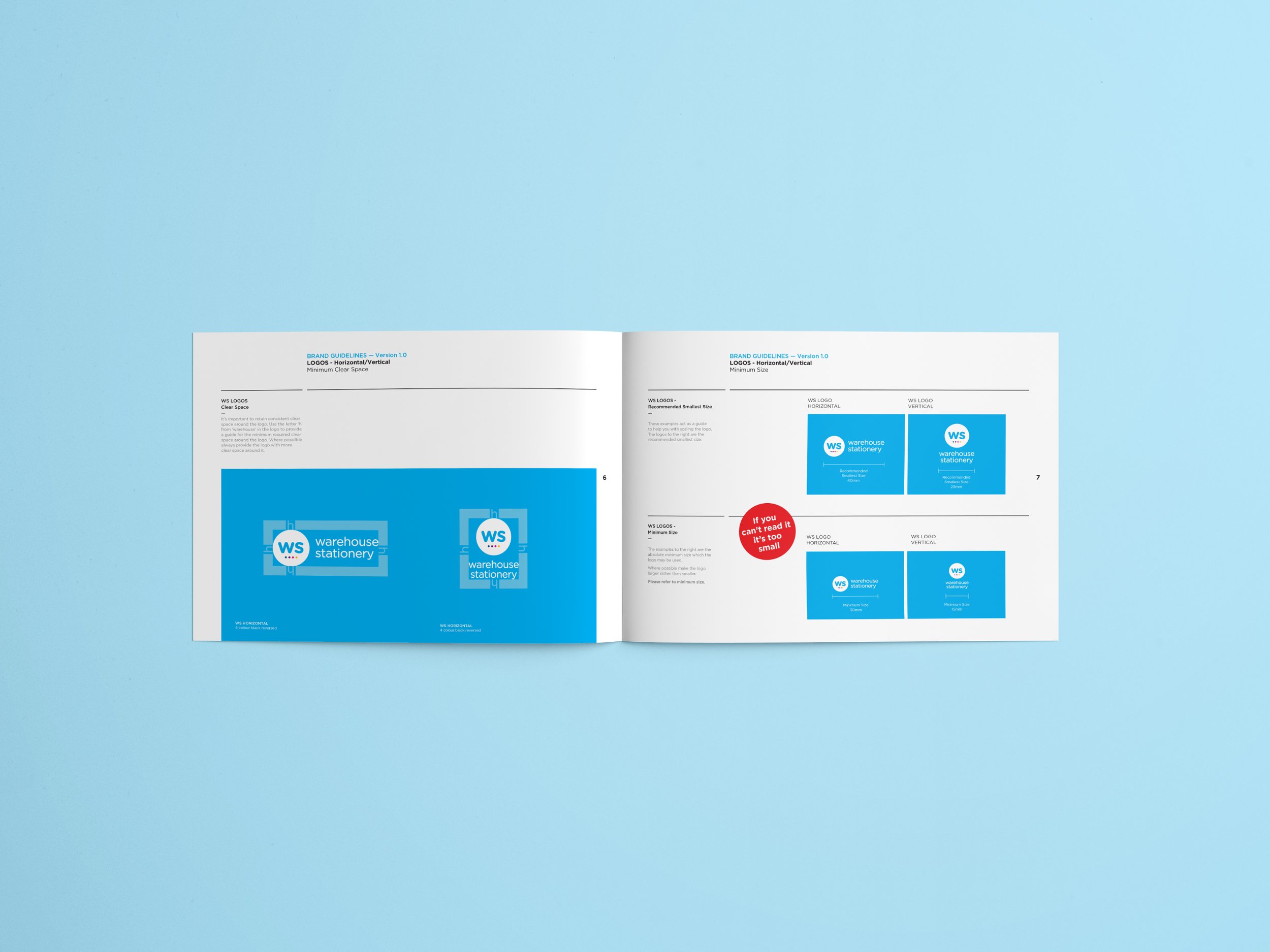
The rebrand of Warehouse Stationery marked a shift from being seen as just a stationery store to a destination for digital, tech, and creative services. The new logo reflects this broader offering, with four coloured dots inspired by UX design to allude to the brand’s new pillars Work, Connect, Study, and Create.
LOGO
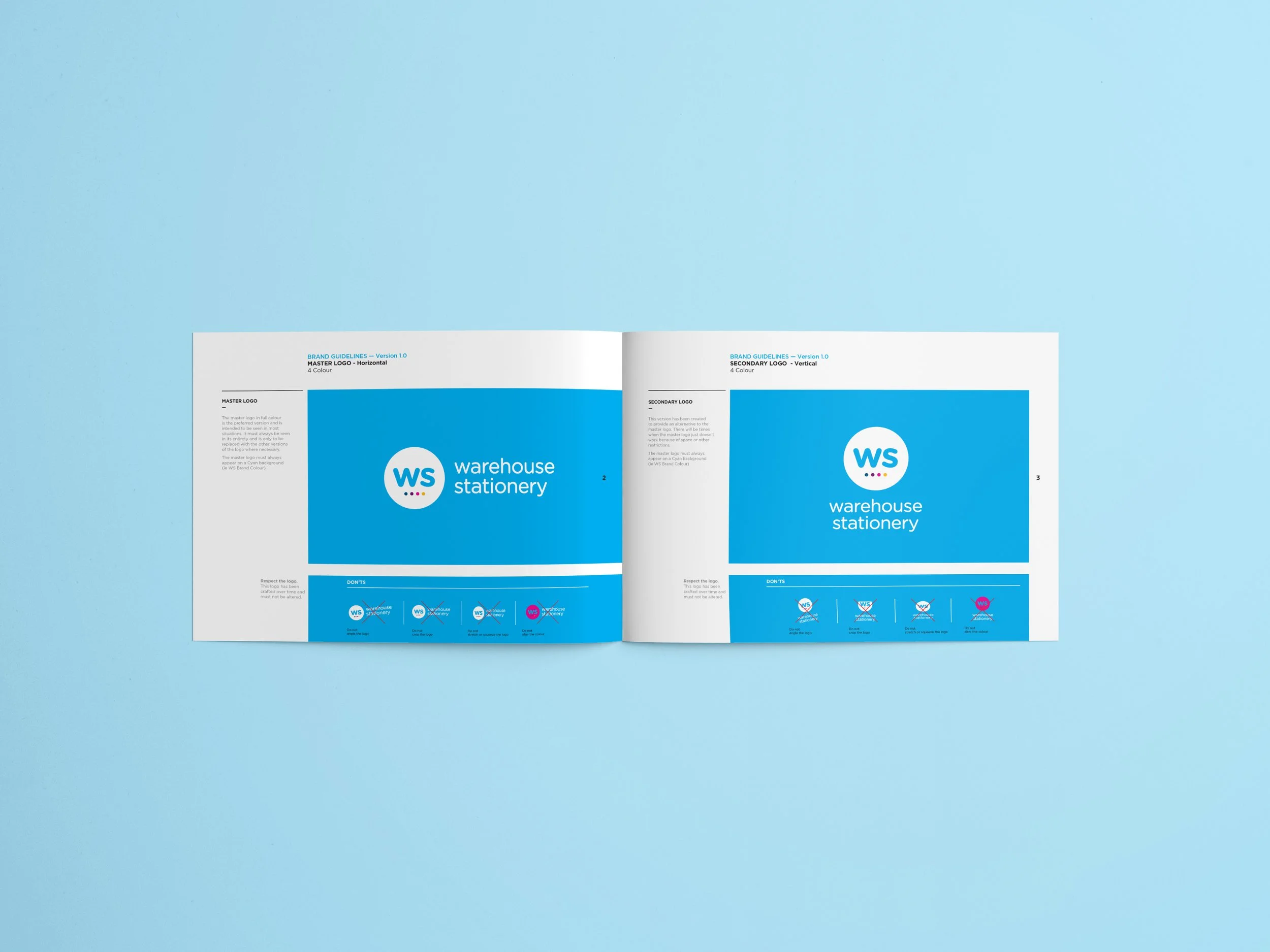
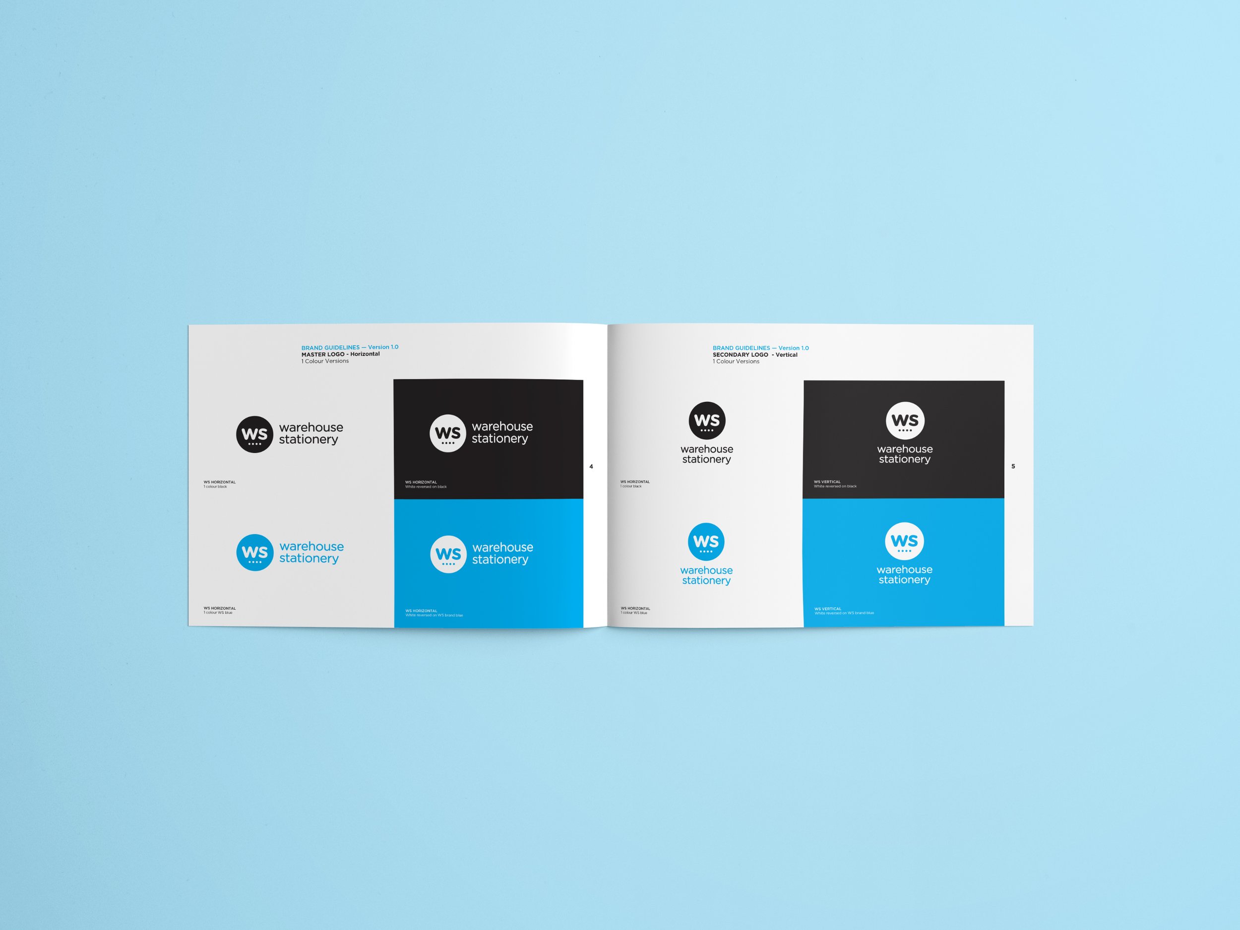


BRAND BOOK
ANIMATION
Environmental graphics including signage, exterior store design, and interior fit out helped the brand stand out in busy commercial hubs where brands compete for attention.